



Valentin Boboc is a Senior Economist at the Institute of Economic Affairs
Most of the ink spilled over the peaks and troughs of housebuilding in Britain revolves around two observations.
First, that housebuilding used to be healthier and more consistent before the Town and Country Planning Act 1947, with the exception of the collapse in housebuilding that occurred during the two World Wars for understandable reasons.
And second, that most housing provision used to be supplied by the private sector unassisted up until the full regulatory impact of the TCPA 1947 was felt. Following this, Britain went through a brief period of significantly lowered construction, most of which was delivered by local authorities, until it returned to the old trend where private provision became dominant once again but extremely bottlenecked.
The peak of British housing construction occurred in the decades between 1920 and 1940, roughly covering the interwar period. None of the subsequent periods in peacetime have achieved similar levels since. Many people have investigated this phenomenon in depth, and I won’t go through the details again, but the reasons revolve around a sequence of poorly designed regulations that dilute property rights and empower an anti-development vocal minority with unwarranted veto powers.
Now that that’s settled, I came across an iconic map of New York showing the decade in which every building was built, and it got me thinking. We know for a fact that nationwide, and in London in particular, construction of new housing in the two decades between 2005 and 2025 doesn’t come anywhere close to the levels of construction that took place between 1920 and 1940.
But the distribution is surely not homogeneous! We certainly shouldn’t expect every street and every neighbourhood to underperform the golden era of construction to the same extent, otherwise people would never complain about regeneration projects or ‘gentrification.’ So I set out to investigate.
Using data from the Valuation Office Agency and the ONS dataset catalogue, we can map out London’s neighbourhood areas and investigate the age of the housing stock in different neighbourhoods.
A neighbourhood is assigned the colour green if the area has more buildings from the interwar period than from the 2005-2025 period and red if the opposite is true.
There is of course a caveat that data from the Valuation Office Agency may be incomplete, but the data is comprehensive enough to give us a strong qualitative impression of what housing construction has been like recently.
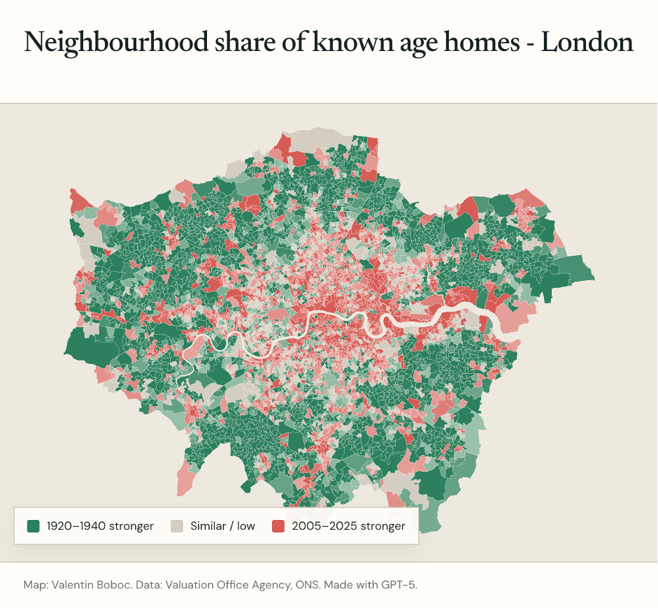
And we see that the results are anything but uniform. Various parts of London have older housing stock and still look broadly the way they did in the interwar period. For example, in Harrow, 52 per cent of known age homes were built between 1920 and 1940.
In contrast, in some neighbourhoods in Tower Hamlets, over 90 per cent of all housing was built in the past two decades. An interesting visual (for a non-Londoner, at least) is that most of the fresher neighbourhoods with newer housing are concentrated in the centre and along the Thames.
I’ve done a similar exercise for Greater Manchester to get a topical comparison.
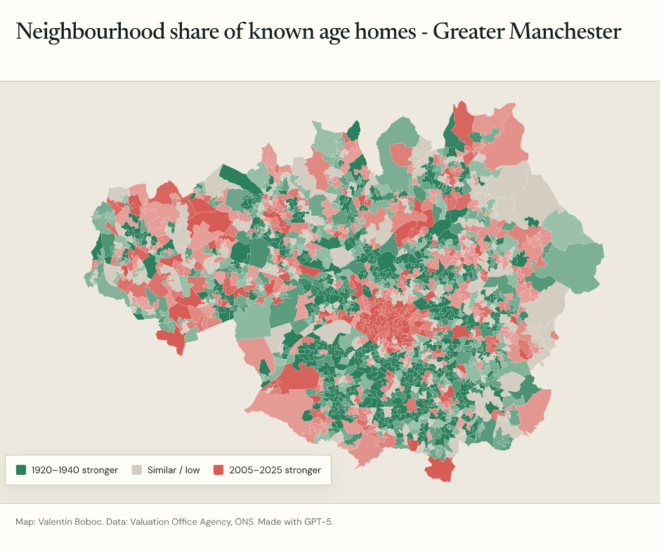
Greater Manchester has a greater share of new housing compared to London even in areas where interwar housing stock is dominant. Another difference is that Manchester has more neighbourhoods in its periphery where new housing outnumbers interwar housing. There is no overconcentration in the centre or along the Manchester canals.
Perhaps the most exciting visual clue about Manchester is the obvious abundance of grey areas. You can see on the map the areas of Manchester where active construction has been going on recently either due to unsupported private development or due to guided regeneration schemes. Places like Stockport and Tameside are actively growing areas at a pace that matches or exceeds the golden age of British housing construction.
As a closing counterfactual, suppose every London borough had built new homes over the past two decades at the same pace as Tower Hamlets. By my back-of-the-envelope arithmetic, London would now have roughly 1.4 million additional homes. Even a fraction of that would have made the city livelier and more affordable.
A very interesting piece of analysis and well worth doing.
Some broader aspects - housing development in the inter-war period was driven by a major economic geography factor .Even in those days, the old northerly based staple industries had lost their economic dynamism. The big new thing was electricity and the growth of industry in the south away from the coal fields, and particularly south east of the country (in the early 1960s remarkably the London region was the most industrial region in the UK). Housing went along with this shift in the economic geography. Post war two important factors: replacing the housing stock lost during the Blitz of cities and then a major slum clearance drive (when lots of houses were actually knocked down and removed from the housing stock). This was made up for in the construction drive of the 60s and 70s in particular.
These factors need to be borne in mind when we are trying to interpret trends in NET housing provision.
The article gives some interesting perspectives. However, it does not give the full picture. One is that the real cost of housing has increased. My 3 bed semi-detached detached originally sold for £600 in 1932. 6 years pay for a skilled worker or 12 years pay for a labourer. Valued at £350k. Somebody on the minimum wage working 37 hours a week would take 15 years to earn this amount before tax.